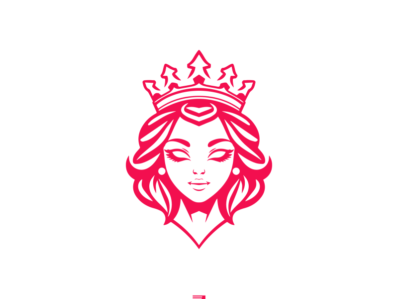
A logo is a crucial component of developing a powerful brand identity for your company. A professionally created logo can aid in building client trust and confidence as well as assist set your company out from the competition. Choosing the proper font is one of the most crucial elements of logo design. The science behind selecting the ideal font for a logo will be examined in this blog post, along with the variables that affect font selection and some advice for selecting the best option.
Visibility is the first factor to take into account when selecting a typeface for a logo. To ensure that your customers can quickly and easily grasp your message, a logo must have an easy-to-read font. The size, weight, and spacing of the typeface are some of the variables that affect legibility. For instance, a typeface with a bold weight will be easier to read than one with a light weight, as will a font with a bigger font size. Additionally, a font’s legibility will increase with appropriate character spacing.
The personality of the typeface should be taken into account while selecting a font for a logo. Fonts can convey a variety of feelings and thoughts. For instance, a sans-serif typeface may offer a sense of modernism and simplicity while a serif font may convey a sense of tradition and elegance. It’s crucial to pick a font that complements your brand’s values and message.
The context of the logo is another essential factor to think about. Different font selections are necessary for different contexts. For example, a colorful and amusing typeface would be ideal for a company logo for a toy manufacturer. On the other hand, a logo for a law office would demand a serious and expert font. It’s crucial to take the logo’s context into account and pick a font that works with it.
The font’s readability should be the final factor. A logo’s typeface needs to be readable in both print and digital modes, so bear that in mind while designing one. In other words, the font ought to be readable both on a computer screen and on printed items like business cards and brochures. This can be done by selecting a font with a good level of readability and by testing the logo in various formats.
Finally, an essential aspect in creating a strong brand identity for your company is selecting the appropriate typeface for your logo. You can make sure that your logo accurately represents your business and contributes to your customers developing trust and credibility by taking into account elements like readability, personality, context, and legibility. Additionally, by heeding these recommendations, you may make a sensible decision and select the ideal font for your logo.