
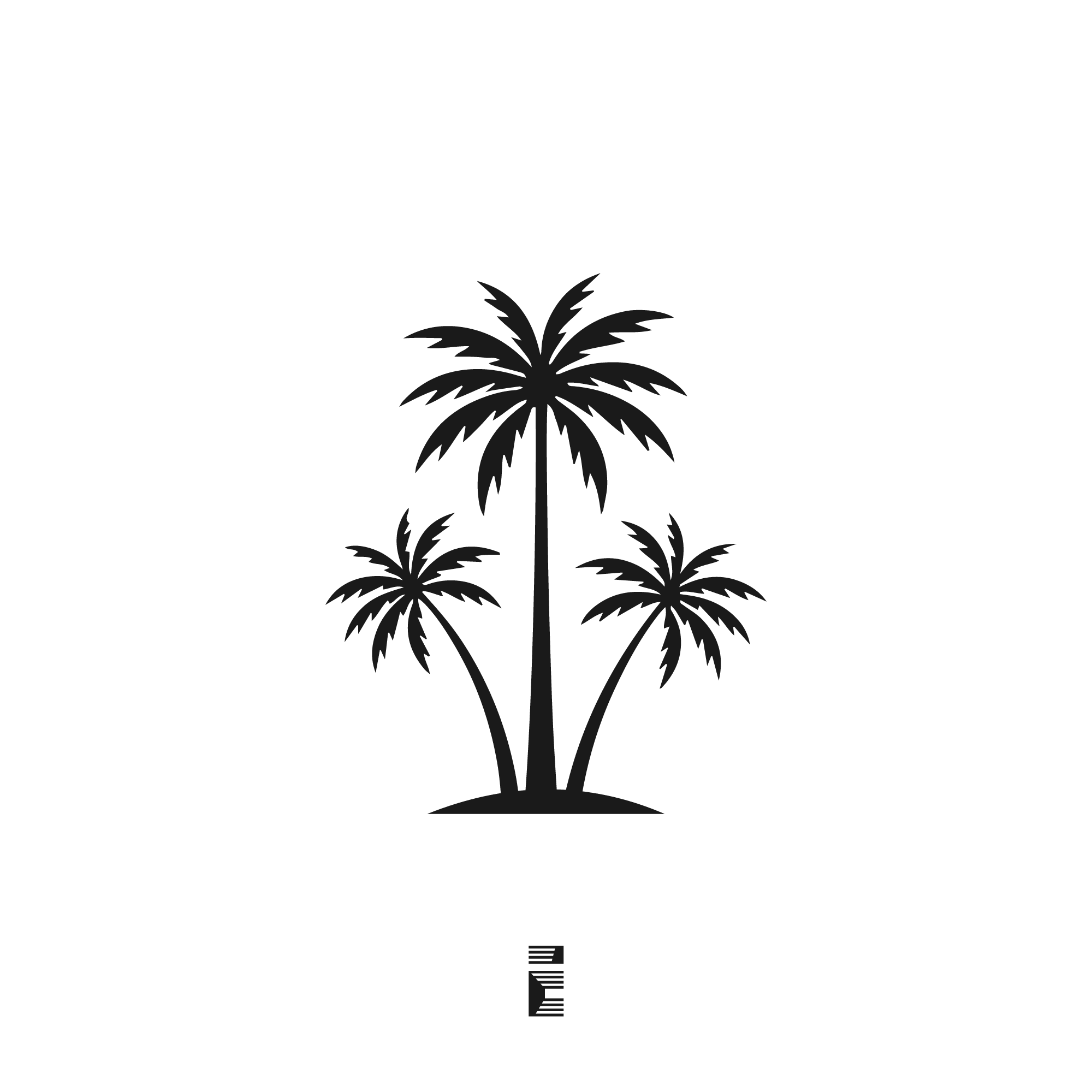
Palm Oasis logo design is a strong visual identity built around a simple idea: three palm trees can communicate luxury, calm, and escape with very little explanation. The logo works because it combines a clear tropical symbol with a balanced silhouette, making it easy to recognize and easy to use across branding materials.
The Instagram caption gives the concept its direction: serenity in silhouette. That message comes through immediately in the artwork. Instead of adding unnecessary decoration, the design focuses on shape, proportion, and contrast, which helps it feel polished and brand-ready.
For businesses in hospitality, travel, wellness, or coastal lifestyle markets, this kind of logo can create the right first impression fast. It suggests relaxation without losing structure, and it feels upscale without becoming overly complex. That balance is what makes the mark useful in real-world branding.
Naming and Concept Behind the Logo
The name Palm Oasis is effective because it combines two ideas that are easy to understand and emotionally rich. “Palm” brings in the tropical, leisure-driven side of the brand, while “Oasis” suggests rest, comfort, and relief from pressure. Together, the name creates a destination feeling.
That matters in branding because customers do not just buy a service or product; they buy an expectation. A name like Palm Oasis suggests a place where people go to unwind, recharge, or enjoy a premium experience. It naturally fits brands that want to feel inviting and memorable.
The logo concept supports that story through the use of three palm trees. The trio adds visual rhythm and reinforces the idea of a small tropical setting rather than a single isolated icon. It feels like a scene, which gives the brand a stronger emotional identity.
Who Is This Logo For?
This logo is best suited to brands that want to communicate calm, leisure, and upscale positioning. It can work especially well when the brand experience is tied to environment, escape, or lifestyle rather than just product function. The design also has enough simplicity to stay relevant over time.
Possible uses include:
-
Boutique resorts and beach hotels.
-
Vacation rentals and luxury villas.
-
Spa and wellness brands.
-
Travel agencies and tour operators.
-
Beach clubs, lounges, and restaurants.
-
Coastal real estate or lifestyle brands.
It is also a strong fit for brands positioned as premium, modern, and relaxed. The silhouette style avoids visual clutter, which helps it look more refined than playful. That makes it suitable for businesses that want sophistication with a warm, approachable tone.
Why This Logo Works
The first reason this Palm Oasis logo design works is simplicity. A logo should be easy to remember and fast to identify, and this one does that well. The palm-tree symbol is familiar, but the arrangement gives it enough personality to feel like a brand asset rather than generic clip art.
Scalability is another major advantage. Because the design relies on bold shapes instead of fine detail, it can work across many sizes and formats. It can appear on a website header, social media profile, business card, packaging, signage, or a branded welcome folder without losing clarity.
Recognizability also plays a big role. Palm trees are widely associated with tropical relaxation, vacations, and warm destinations. That means the audience immediately understands the mood the logo is trying to create, which is valuable for fast brand recall.
The logo is also practical in real branding. It is the kind of mark that can sit beside a wordmark, stand alone as a symbol, or be adapted into a full identity system. That flexibility is important because strong branding should work in both digital and physical settings.
Design hierarchy helps this kind of logo perform well. Clear contrast, scale, and grouping guide the eye through the composition and make the message easier to absorb. Google also notes that structured, clearly presented content helps systems understand a page more effectively, which is useful when brand assets are being published online.
Design Characteristics and Visual Impact
The most noticeable feature is the vertical structure. The central palm is tall and dominant, while the two smaller palms create balance on either side. That composition gives the logo a stable foundation while still allowing it to feel open and airy.
The curved trunks add movement without making the design feel busy. The fronds are stylized enough to communicate palm leaves instantly, but simplified enough to keep the silhouette clean. This is important because too much detail would weaken the mark at smaller sizes.
The base also matters. It grounds the design visually and keeps the palms from floating unnaturally on the page. That small decision adds weight and structure, which makes the logo feel more deliberate and professionally built.
Emotionally, the design sends a calm signal. The tree forms suggest warmth and relaxation, while the symmetrical arrangement adds order and control. That combination creates a premium mood that works well for brands in hospitality and lifestyle markets.
The overall effect is confident and understated. It does not try to be loud or trendy. Instead, it focuses on a lasting visual identity that can support a brand for years.
Final Thoughts
Palm Oasis logo design succeeds because it turns a simple tropical icon into a clear brand statement. It suggests luxury, serenity, and escape in a way that feels clean and professional. That makes it a smart choice for brands that want to look premium without becoming overly ornate.
For businesses ready to build a full identity around this direction, the next step is turning the concept into a complete brand system. That can include logo refinements, typography pairing, color selection, and usage guidance for web and print. Contact for custom logo development and availability for brand packages can be positioned here as a direct call to action.

One thought on “Palm Oasis logo design: a clean tropical mark with premium appeal”
Comments are closed.