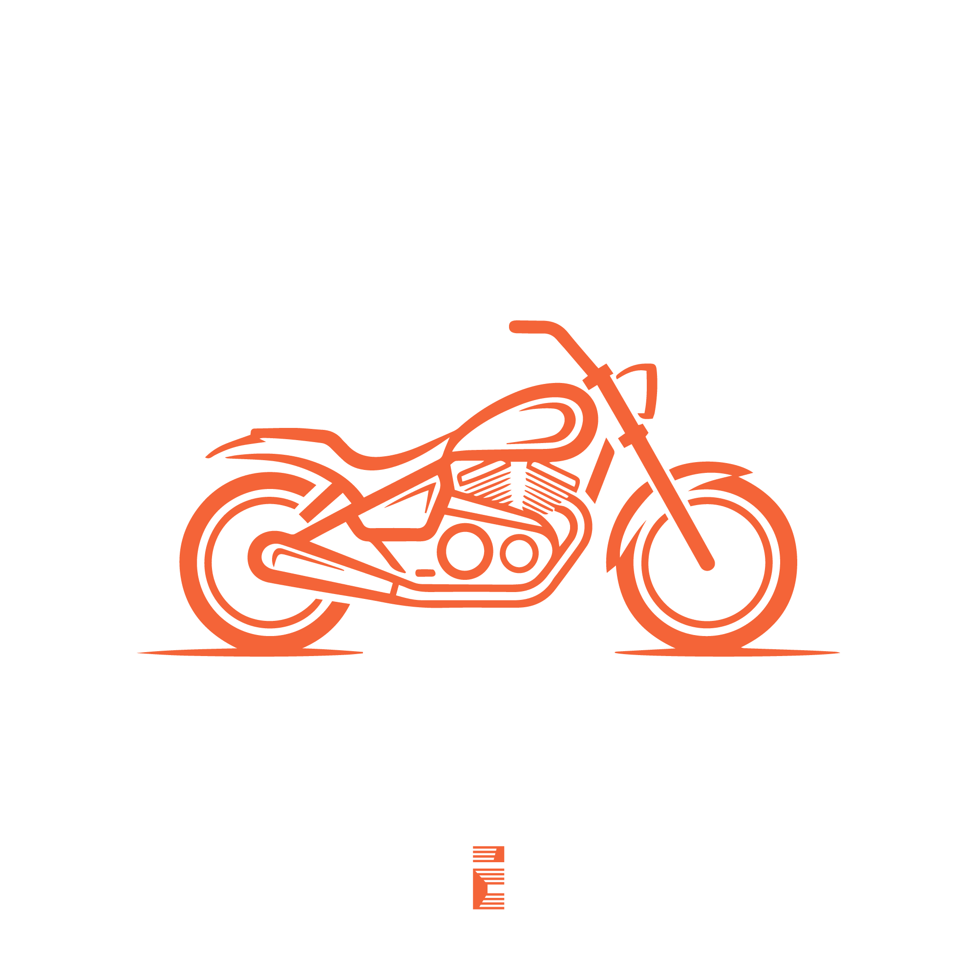
MOTOSOUL is a motorcycle brand identity built around a clear idea: the ride comes first. The logo uses a classic cruiser silhouette to communicate freedom, movement, and a strong connection to the open road. It feels direct, memorable, and easy to understand at a glance.
The MOTOSOUL concept works because it does not try to overcomplicate the message. Instead, it focuses on what matters most to the audience: the feeling of riding, the confidence of a solid machine, and the independence that comes with the highway lifestyle. That makes it a strong visual direction for a brand that wants to look authentic, bold, and rider-focused.
Naming and Concept Behind the Logo
The name MOTOSOUL combines two ideas that fit naturally together: “moto,” which immediately points to motorcycles, and “soul,” which adds emotion, identity, and personal connection. Together, the name suggests more than transportation. It suggests a lifestyle, a mindset, and a deep relationship with the road.
The logo reflects that idea through a cruiser-style motorcycle illustration. The silhouette is simple but recognizable, which helps the brand communicate fast. Cruiser motorcycles are often associated with long rides, comfort, freedom, and a steady pace, so the visual direction supports the name perfectly.
The orange linework adds energy without making the design feel aggressive. It gives the logo a warm, active presence that feels modern while still staying connected to classic motorcycle culture. The result is a brand mark that speaks to riders who value individuality and the experience of the journey.
Who Is This Logo For?
-
Motorcycle brands that focus on cruisers, custom bikes, or lifestyle riding.
-
Bike shops and workshops that want a strong, professional identity.
-
Motorcycle apparel brands selling jackets, helmets, gloves, or riding gear.
-
Touring and road-trip brands built around adventure and long-distance travel.
-
Custom garage businesses that want a clean visual identity with personality.
-
Event organizers for biker rallies, ride clubs, or motorcycle meetups.
-
Content brands, blogs, or YouTube channels focused on motorcycle culture.
-
Accessories and aftermarket parts companies targeting riders with a strong brand image.
This logo is especially effective for brands that want to position themselves as confident, practical, and rooted in riding culture. It is not trying to appeal to everyone. It is built for a specific audience that understands motorcycles as part of a lifestyle, not just a product category.
Why This Logo Works
The first strength of this logo is its simplicity. The bike is reduced to essential lines, which makes the design easy to recognize and easy to remember. A simple silhouette also helps the brand stay clear in crowded visual environments, from websites to patches to packaging.
It also has strong scalability. Because the design is built from clean outlines and balanced shapes, it can work at different sizes without losing its identity. That matters for real-world branding, where a logo may need to appear on a storefront sign, a social media profile, a hoodie tag, or a helmet decal.
Recognizability is another major advantage. The motorcycle form is immediately understandable, and the cruiser style reinforces the exact brand mood suggested by the name. People do not need to study the logo to understand what it represents, which is a major advantage in branding.
The logo also has strong real-world usability. It looks suitable for print, embroidery, laser engraving, stickers, vehicle graphics, and digital platforms. That flexibility makes it a practical logo system, not just a nice-looking illustration. A logo with this kind of usability is easier to grow with over time.
Design Characteristics and Visual Impact
Shapes
The design relies on flowing, continuous lines that echo the curves of a cruiser motorcycle. These shapes create movement and rhythm without making the logo feel busy. Rounded elements also help the brand feel approachable and human, which is useful for a lifestyle-driven identity.
The wheels, frame, fuel tank, and engine are all simplified into readable forms. That balance between detail and restraint is important. It gives the logo enough character to feel custom while still keeping the structure clean.
Composition
The motorcycle is centered and visually grounded, which gives the logo stability. The horizontal orientation works well for brand applications because it naturally fits headers, banners, labels, and horizontal layouts. The composition also creates a sense of forward motion, even though the motorcycle itself is static.
The spacing between the major parts of the bike is controlled and intentional. Nothing feels overcrowded, and that improves clarity. This is especially valuable for a logo that may be used in both large and small formats.
Balance
The front and rear sections of the bike are visually balanced, so the silhouette feels complete and confident. The orange outline gives the design enough presence to stand out without needing gradients or extra effects. That makes the logo feel modern, but still grounded in a classic motorcycling aesthetic.
The small central emblem below the motorcycle adds a finishing detail that supports the brand system. It can work as a secondary mark or brand accent, helping create consistency across future visuals. That kind of detail can strengthen a brand identity when used carefully.
Emotional Impact
This logo creates a feeling of motion, independence, and self-direction. It does not rely on slogans or decorative elements to communicate attitude. Instead, the visual form itself carries the message.
That emotional clarity is valuable because motorcycle brands often depend on identity as much as function. Riders want to connect with brands that feel authentic and aligned with their mindset. MOTOSOUL achieves that by presenting a clean, confident cruiser image that feels ready for the road.
Final Thoughts
MOTOSOUL is a strong logo direction for any brand built around cruiser culture, road freedom, and rider identity. It combines a clear motorcycle silhouette with a memorable name and a practical visual style that can work across many brand touchpoints. The result is a logo that feels polished, usable, and easy to build into a full brand system.
If you are developing a motorcycle brand, custom garage identity, or riding-focused business, this concept offers a solid foundation for recognition and trust. For logo refinements, brand expansion, or a full identity system, contact us to discuss the next step.