Voxelline — The Low Poly Wolf Logo That Means Business
Every great logo tells a story before a single word is spoken. This one? It hits differently.
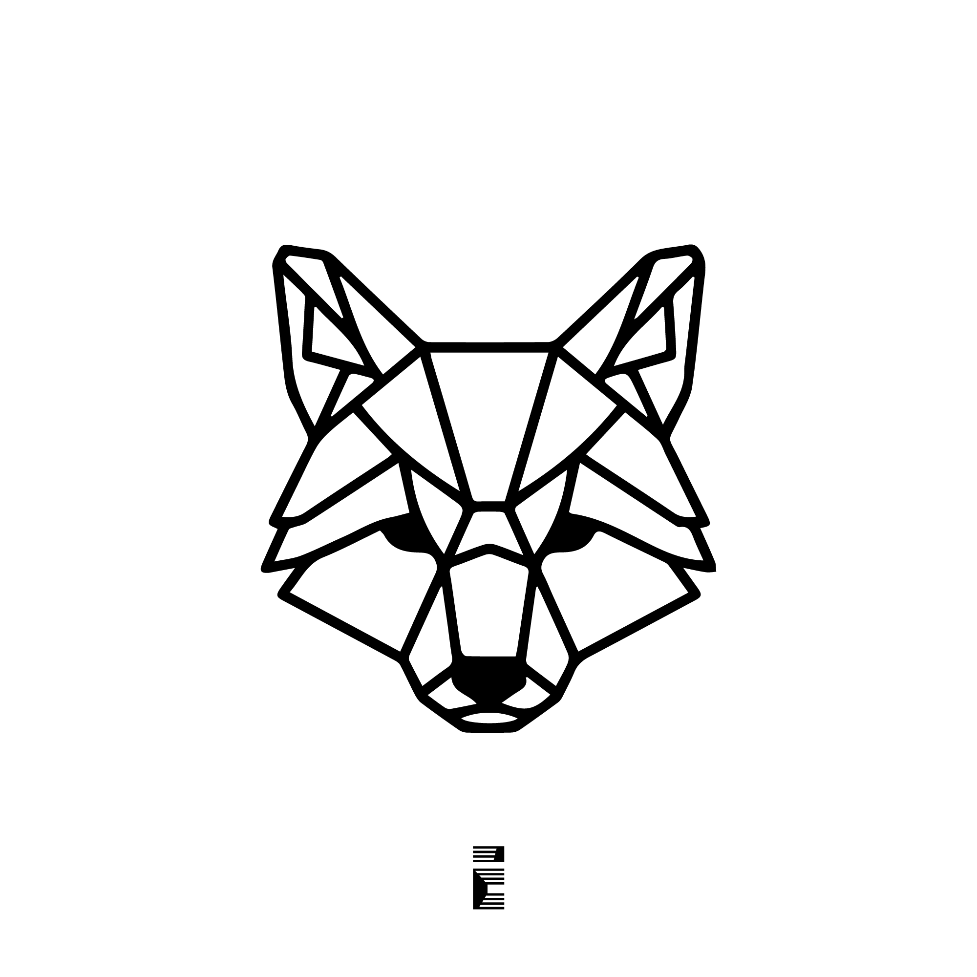
Meet Voxelline — a sharp, geometric wolf head built entirely from triangular facets and deliberate angles. No gradients. No fluff. Just clean structural lines that command attention from the first glance.
Why a Wolf?
The wolf isn’t a random choice. Across cultures and centuries, wolves have symbolized instinct, guardianship, and relentless forward motion. They hunt with precision. They move as a unit. And they never apologize for being exactly what they are.
For a brand that wants to project agility and raw capability, few symbols carry that weight as naturally as a wolf. It’s primal — yet deeply sophisticated when rendered correctly.
The Low-Poly Aesthetic: More Than a Trend
Low-poly design took the creative world by storm, and it hasn’t slowed down. Here’s why it still works in 2026:
-
Structural clarity — every triangle has a purpose; nothing is decorative noise
-
Scalability — a geometric mark reads perfectly at 16px or 1600px
-
Timelessness — unlike hyper-detailed illustrations, flat polygon work ages gracefully
-
Versatility — works on dark backgrounds, light backgrounds, merchandise, digital, print
The Voxelline wolf uses the low-poly grid to echo something almost architectural. It doesn’t just look like a wolf — it feels engineered, like the identity of a brand that builds things with intention.
What “Cutting-Edge Aesthetic” Actually Looks Like
There’s a difference between a logo that looks modern and one that is modern. Voxelline lands in the second category.
The symmetry is deliberate — it communicates balance and control. The sharp ear points and angular muzzle create visual tension, the kind that keeps your eye moving across the mark. And the negative space within the facets? That’s where the real craft lives. Geometric logos that leverage negative space cleverly create a dual-reading effect — your brain processes the whole and the parts simultaneously.
That’s not just art. That’s communication design doing exactly what it should.
Who Should Use a Logo Like This?
Honestly, a broader range of brands than you’d expect. The wolf’s symbolism maps cleanly onto:
If your brand plays in any of these spaces — or simply wants to project power with purpose — a geometric wolf mark fits like a tailored suit.
The Design Details Worth Noticing
Step back, then step closer. Voxelline rewards both views.
At a distance, the silhouette reads instantly as a wolf head — symmetric, composed, iconic. Up close, the internal line structure reveals a faceted geometry that feels almost crystalline. The eyes — rendered as solid filled shapes — anchor the design and give it presence. Pull those out and the whole thing loses its soul.
The nose is another quiet masterstroke. Small, solid, triangular. It grounds the lower third of the composition without competing with the eyes for attention. This kind of visual hierarchy through restraint is what separates average logo work from marks that genuinely stick.
This Logo Is Available — As Is
Voxelline is a ready-to-use logo concept, offered as a finished mark with no modifications. What you see is what you get — and what you get is a lot.
If you’re a founder, a studio, a team, or a brand looking for an identity that carries real visual weight without the months-long branding process, this is worth a serious look.
Interested? Get in touch. A brief email conversation is all it takes to get the ball rolling.
Got Your Own Project in Mind?
Every brand has its own story. Not every story fits a premade mark — and that’s okay. Custom logo design starts with a conversation about who you are and what you want people to feel when they see your name.
Whether you need a wordmark, a symbol, a full brand identity, or something you can’t quite name yet — that’s the challenge worth taking on. Drop a message and let’s figure it out together.
Voxelline — structural by design, powerful by nature.