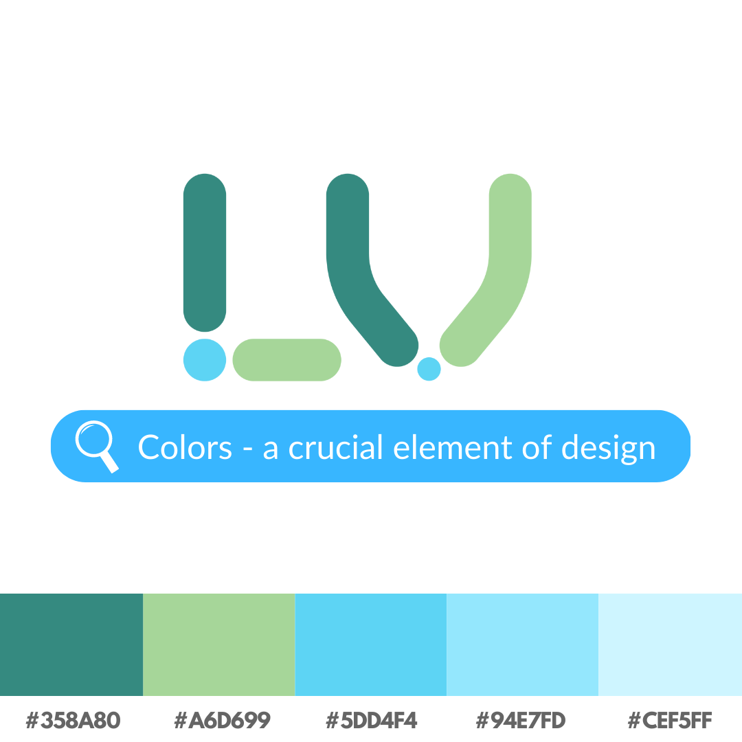
Colors are an essential component of design because they have the power to evoke feelings, alter perceptions, and influence the overall look and feel of a project. The color decisions we make can have a significant impact on the outcome, from strong and dazzling to subtle and understated.
It’s crucial to take color psychology into account when utilizing color in design. Choosing the appropriate hues might help to convey the intended tone and message because different colors can provoke different emotions and associations. For instance, whereas blue is frequently perceived as tranquil and reliable, red is frequently connected with passion and intensity.
Also, it’s important to think about the context in which the design will be used. Colors have diverse meanings in different cultures, so what is appropriate in one setting could not be in another. For instance, white is frequently linked with innocence and purity in Western cultures, yet it is frequently connected with death and grief in Eastern cultures.
It’s necessary to take into account the technical aspects of color utilization in design in addition to the psychological affects of color. This covers concepts like color harmony, which describes how various hues blend together, and color contrast, which describes the variation in brightness or darkness between various hues. The overall aesthetic of a design can be significantly influenced by both of these elements.
Overall, color is a potent element in design, and great thought should be given to how to use it to produce compelling visuals. Taking the time to consider the function that color will play may make all the difference in the outcome, whether you’re working on a logo, website, or any other design project.